|
Today I'm talking about the monoprint DVD or CD face. In our world of optical disc production, the monoprint disc is the base price option for your CD duplication or DVD duplication projects. Low man on the pricing totem pole, the monoprint disc is the assumed option with the full color disc printing options slotted as the upgrades. But don't let that scare you away. You can still get an amazing disc face using this most basic printing method. Referred to as monoprint and monocolor (one-color), your disc face will have a single color of print directly applied to the silver surface, most often that one color is black. The black on silver combination is actually quite versatile, making for a disc that is clean and clinical, playful and inviting, strong and bold or humble and understated. That's up to you and the design choices you make. Let's take a quick minute and learn a little bit about this process and the limitations. First, this is a thermal process and is therefore a very durable print method. This thermal process utilizes a single color of ribbon, usually black, but other options include a basic red or a royal blue. We're going to discuss black ribbon, but these other options are available. The ribbon color as a solid is the only option for your print. With this in mind, let's run through some quick DO's and DON'Ts for designing your monoprint CD and DVD art.  DON'T design your monoprint CD or DVD with a black and white photo. Yes, a black and white photo is technically one color, but this method doesn't produce the shades of gray needed to print a photo. It will look blotchy and amateurish. If you love the look of a black and white photo, I recommend you opt for a full color print method to achieve those shading transitions.  DON'T design your monprint DVD or CD with an all black background and silver text. Yes, this is a cool look, but this print method doesn't do well with large coverage areas. If you want your single bold word to look silver on a black background, opt for a full color method on a silver disc to achieve the coverage needed. We'll discuss those effects in future articles.  DON'T design your monoprint CD or DVD with drop shadows and shaded lettering. Remember, any shade of gray will either print as solid black or not at all, leaving your text difficult if not impossible to read.  DO design your monoprint DVD or CD with fonts to match the other components of your packaging. Using the same typeface and lettering design from your cover for the disc face brings the whole project together.  DO design your monoprint CD or DVD using line art. If you are using a logo, see if you can find a single color version and convert it to solid black. If using clip art, look for clean, solid lines and fills.  DO design your monoprint DVD or CD with imagery that is black on white. You can simplify even black and white photos sometimes down to line art images. These will add personality and customization. So to recap, DON’T design your disc with black and white photos, very large ink coverage or drop shadows. DO match your disc art to the other parts of your packaging with similar fonts, line art and keep the layout black on a white background. Follow these guidelines and you’ll end up with a professional, commercial looking monocolor disc face.
2 Comments
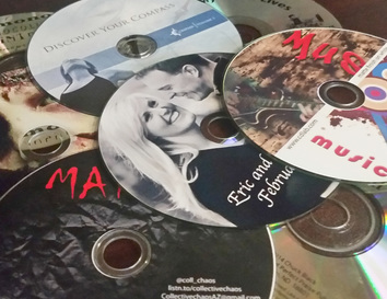 There are a lot of packaging and distribution options for your CD duplication project. The same of course is true for your DVD duplicating and your BluRay manufacturing. If you’re replicating your discs, that means you’re ordering more of them and those choices carry a little more weight and expense. But regardless of your packaging and quantity choices, regardless of where you fall on the food chain of your industry and regardless of your project’s budget, your disc has a face and it warrants thoughtful consideration. Here are some common questions to think about.
Which side of the disc is the face? (Don’t snicker, not everyone knows this. Remember, this blog is a safe place to learn without judgment.) Every disc is two sided. Your disc reader – cd player or dvd/bluray player – reads from the bottom of the disc. This is where the content is stored and the side that faces down when you put it in the tray. The reverse side, or top is the “face” and that’s what we are discussing here. Why does the disc face even matter? I can draw a lot of analogies that don’t quite fit, like judging a book by its cover or looks not mattering as much as a brain. But this isn’t exactly the same thing. The point is, you’re going to have something on the disc face, it may as well add value. This isn’t to say that your disc art needs to be a work of art. If it’s just text, have it be legible and professional looking. This will add credibility to the content. Use a whimsical title font to communicate a light, playful vibe. Use a great illustration to reinforce the creativity of the musician. A brooding close up photo of the artist might support the intense tone or mood of some content. The disc face is another opportunity to communicate with your audience, don’t squander it. So what should I put on my disc face? I like to have my clients imagine that someone came across the disc in a player with none of the supporting packaging. What would you want them to know? If it’s a music CD and they like what they hear, they’ll want to know the artist’s name and where to find out more about them. Maybe a website where they can sample their work, buy another album or see their touring schedule. If it’s a movie, they’ll be sure to have the title and applicable production credits. Copyright information is always a good idea. You might include the book title, author’s name and chapter titles for an audio book as well as the disc number. A slideshow of family photos you give as favors at a reunion might include the family name, date span of photos and perhaps contact information in case found. Look at what other people are doing with their disc faces in similar industries and copy that information. Should I pay extra for a full color disc face? A full color disc face adds a little expense to a project, but sometimes it is worth it. Maybe you aren’t doing a case and the disc face needs to be the project cover showing through the window of a paper sleeve. Maybe you’re doing a monthly disc as a promotional item for your business and you want your clients to anticipate the content by having your logo and branding colorful and prominent. Maybe you just like the showmanship a color disc offers. Maybe your disc’s content is about being frugal and managing money, in which case a full color disc face might be perceived as excessive. Maybe the bells and whistles are on the full cover inserts of your packaging and you don’t need the flash on the disc face, just the same font as the cover to continue the branding. Let the project dictate what’s appropriate. If I’m going with color disc printing, what are my options? There are 3 main color printing methods for disc faces. Traditional offset printing, thermal color printing and inkjet color printing. Offset printing is the option you’ll get when replicating your discs. The finish is between shiny and matte, with a slight sheen. In general, a thermal disc print yields a shiny disc and the inkjet process yields a matte finished disc. These are the two options available to you for short run or low volume duplicating. Some clients associate the shiny disc face with a more commercial product. Some people prefer the matte finish, thinking it is more sophisticated. If the image is an old sepia toned photograph, matte might be the right design choice. A colorful, modern design might look best shiny. Just keep in mind the print of the inkjet disc could smear if the surface gets wet. The thermal process yields a much more durable print and is the more expensive option. Offset, thermal or inkjet, your budget and design choices should steer this choice. Let’s face it (see what I did there?), your disc face is important. Don’t get caught up in what the only right choice is. I’ll be spending some time later talking through some specific design tips for each disc printing option. For now, I hope I’ve inspired you to really think about your disc project and your intended audience. Please follow our blog as we face your concerns with more than just a pretty face and a lot more fun than a slap in the face… (Too much? Now I’m red in the face!) |

AuthorI'm Donna Palmer and I've been helping clients manage their optical disc projects and meeting their deadlines for some time now. In fact, CD-Lab has been in the optical disc business for 17 years. A graphic designer by trade, I know all the tricks and shortcuts and can demistify the design process. I love expanding the knowledge of my clients and learn from every project we do. This is a place to share some of that insight with you. Please join me. Archives
June 2017
Categories |

 RSS Feed