|
Here are 3 simple options for incorporating your logo into your disc design.  The first is really basic and appropriate for the simplest monoprint disc face. You simply look at the circle of the disc face as a clock face and place your logo in either the 12, 3, 6 or 9 o'clock locations. It keeps the look uncluttered and your logo easy to read.  The next option I refer to as ghosting. This can be done over a solid background color, but I like to do it over a photo. In this example, I centered the logo over the center of the flower. I just changed the color of the logo to all white and screened it back from 100% to 48% opacity so it was see through. This is a more subtle approach, but can look really sophisticated. 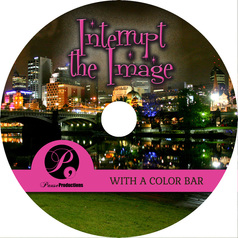 The third option, and an easy go to solution, is to interrupt a background image with a bar of color. I let the color go all the way across the disc face. In this case, I added a bump or partial circle so the whole logo would fit nicely. I also sampled a color from the background image for the color of the bar - see the pink light from the building on the far left? That helps tie the visual elements together. There are so many variations you can do with your art. These were just a few to start you thinking about some options for your disc design. I'll be sharing a lot more tips on disc design, so be sure to stay tuned!
0 Comments
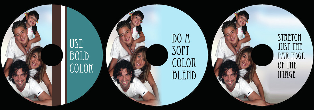
When designing your disc face, a full color photo adds a lot of impact. But what do you do when the perfect photo is just too narrow? I have a few solutions for you. Let's look at the example in this first trio of images. The left image shows the photo and it is clearly not filling the disc face. The center hole is covering an important pieces of the image. What if we just stretch the image wider? You can see in the middle photo that the faces are now distorted and the center circle is still in the way. What if instead of stretching, we just enlarge the whole image? If we do that, you can see the top and bottom of the photo are getting cropped out. Don't get frustrated, let's move onto the solution. In the next trio of images, I'm showing you a few solutions. To start, move your photo to a position where the important pieces of the image are not cropped. In this case, moving it to the left solves that issue. To fill the empty space, we can do one of the following. We can do some bold color blocking. The left image shows a bold stripe dividing the two halves and some bright color under the text. This can be a very striking and fun option. In the center, we go the other direction and blend a soft color over the white space and into the photo. This is a more subtle effect and because of the colors in this particular image, has an ethereal feel. On the right, we see a technique I use a lot. Instead of stretching the entire image, I just select a sliver of the photo edge and stretch it. That way the background colors can continue across the disc without distorting any of the people's face. I think all three solutions would make a really sharp, commercial looking disc face. Don't be afraid to combine some ideas. There are certainly more than 3 solutions to this common problem. This is just a starting point to help you find the right design choices for your project. Stay tuned as I explore more solutions for your design dilemmas. In this evolving world of marketing via the internet, it's obvious that one of the most important things you can do to market your product, whether it is a band or a physical product, is to be seen online. We all want to improve our search results. Duh, right?
I don't want to pretend to be some online guru who knows all about "Search Engine Optimization". I'm not, but all you have to do is search for the keyword SEO and you will be swamped with all sorts of advice and opinions. I know this because I've been there. Done that. There is lots of good advice as well as bad advice. The tough part is figuring out what is best for you and your product. It is a never ending pursuit that is always changing. But don't be discouraged because Google or whoever you search with is ultimately interested in delivering the best possible search results for the keywords that you enter. So, if you build a good site and follow some basic rules you will eventually do well. So let's focus on one area that we can all improve on, Social Networks. I'm talking about Facebook, Twitter, Google+, Instagram, LinkedIn, Pinterest, etc. The basic rule for all of these is the more activity andfollowers you have the better you will do in search results. Activity means you should post regularly. Notice, I didn't say daily or weekly but regularly. Pick a schedule you can achieve and try to stick with it. The other factor is how many people you interact with. Search engines will add points for you if you have a following. Whether it's page Likes on Facebook or Instagram, followers on Twitter or whatever the particular buzz word is on each of these networks, quantity is important. Try to get as many people as possible to show interest in you or your product. Ask people to follow you and share your pages. In return, do the same for them. To get started we would be more than happy to follow you. Just let us know your page or pages that you would like to share with us and consider it done. Do this for your friends and business associates as often as you can. It builds good relationships and helps everyone prosper. So now that you are feeling inspired, how about showing us some love here at CD-Lab? Or maybe even a review? Here's our links: Google+ Yelp See, that's not so hard is it? |
AuthorI'm Donna Palmer and I've been helping clients manage their optical disc projects and meeting their deadlines for some time now. In fact, CD-Lab has been in the optical disc business for 17 years. A graphic designer by trade, I know all the tricks and shortcuts and can demistify the design process. I love expanding the knowledge of my clients and learn from every project we do. This is a place to share some of that insight with you. Please join me. Archives
June 2017
Categories |



 RSS Feed
