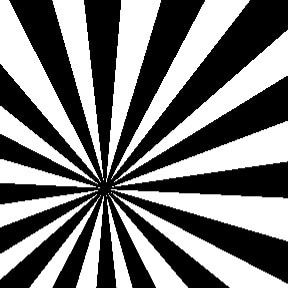
 Today I want to address how to begin your design when you literally have NOTHING in mind - no photos or illustrations, no inspiration pieces that you want to duplicate. It may seem daunting, but there is a way to start when you have no idea where you want to go. Find a graphic element. Any graphic element that you can use in your design. This can be a stripe pattern, a sprig of leaves, a silhouetted shape. Start with something that is only one color, like the stripes I've selected on the right. They are graphic and bold and I like that they radiate from a common point. This will be my starting graphic element. This might be a tough starting point for some of you. After all, the graphic I chose isn't exactly folksy or classical or lyrical. It isn't retro or modern or old fashioned. It isn't really any of those things...yet. But trust me, we can do a lot with these simple radiating stripes. 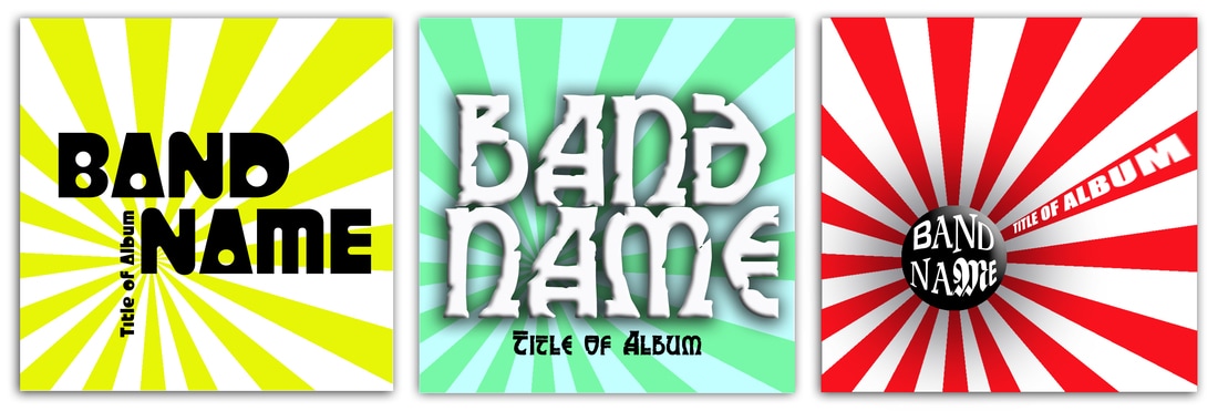 Lets look at this first set of examples. In all three examples, I have the graphic in the same location. I'm using the graphic merely as a background element to the text. Depending on what I do with the text, a different tone is set. In the far left version, I used an acidic yellow stripe with a bold black and retro styled typeface. This has a very different vibe than the middle one where I used a Celtic style font with a "bevel and emboss" filter over the band name along with a drop shadow. I also made the striped graphic low contrast to the background color. On the far right, I put a black circle in the center with the "bevel and emboss" filter and an exaggerated shadow. This makes the stripes appear as if they're going back farther. I used a "bulge" filter on the band name so it filled the circle and put the album name reversed out of a stripe. This has a much more playful, active effect. You're almost waiting for the black ball to bounce forward. Using different colors and text styling, suddenly this is a very versatile graphic element. Let look at some other examples. 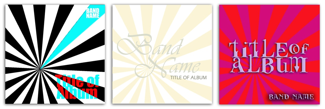 Here I have three more, very different examples. I've kept the bold black and white of the original graphic on the left, but changed one of the stripes to a bright cyan. Since this is an area of focus now, I have the band name placed right over it in the top corner. The Title of Album is in a bold font that has a "difference" filter applied. That text is actually assigned a red color, but it goes to the bright cyan wherever it has white behind it. This is a simple filter that looks complicated and has a big effect. Going completely the other way, we have a super subtle effect on the center example. This is a more tonal treatment of the graphic. Very soft and complimented by the script text styling. Even the colors of the text elements are soft. And then we swing that pendulum back to the very bold and graphic right example. We have the tension of the red stripes over a hot pink background. The font is a little crazy, but it somehow seems appropriate to this styling. Now let's take these same three examples and add another element, a grungy, scratch background texture. 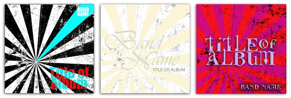 All I've done here is add a grunge layer of texture to the layout. On the far left, I used a filter called "difference" and it has the textural lines reverse out of the black stripes so you see the texture in white on the black stripes. I put this layer behind the bright cyan ray, I liked having that element clean. In the center, I put that textured layer behind the subtle beige stripes so your eye would have a resting spot. I also lightened the color on the background texture for this one. It allows it to remain subtle. On the right, I have a "multiply" feature applied to the grunge layer so it shows through to both the pink and red stripes. Hopefully I've got you inspired and thinking outside the box. Let's go ahead and take our graphic and add another image. Remember, the graphic was a starting point. Let's see where we end up with another element. 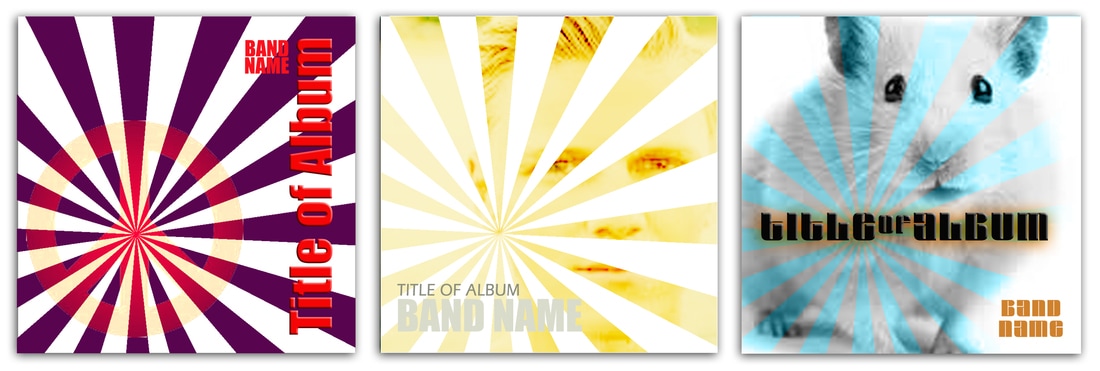 In the example on the left, the element I added was a simple peace sign. I centered it over the origin of the radiating stripes and added a "hard light" filter. This allows it to change a bit as it goes over the dark purple stripes. Again, a simple filter that has a really cool effect. I ran the text vertically with a "bevel and emboss" treatment for extra punch. On the center example, I'm using the photo of a man's face. The photo is in front of the stripes and has a filter called "color burn" so it only reacts over the stripes and appears to be missing on the white background. I really like this effect. It is subtle and a little mysterious. I think it holds the viewers attention. The low contrast color on the text also gives the image more importance. My little hamster buddy on the right has a filter called "luminosity" applied. It lets you see the whole image, but treats the image differently where the color bands intersect it. You don't see the color bands extending beyond the image. Again, a very simple treatment. The text has a "bevel and emboss" treatment and I added a "drop shadow" in a warm caramel color to contrast the blue stripes.
In most of these examples. I'm referencing filters I used when working in Photoshop. There are lots of design programs out there and lots of filters that can be applied. I encourage you to play around with the different options for your imagery. You just may stumble upon the perfect combination for your project. And remember, you don't always need to know where you're going with your design, you just need to start!
1 Comment
|

AuthorI'm Donna Palmer and I've been helping clients manage their optical disc projects and meeting their deadlines for some time now. In fact, CD-Lab has been in the optical disc business for 17 years. A graphic designer by trade, I know all the tricks and shortcuts and can demistify the design process. I love expanding the knowledge of my clients and learn from every project we do. This is a place to share some of that insight with you. Please join me. Archives
June 2017
Categories |

 RSS Feed
Optical Disc Products and Services since 1998
|
Contact Info:
CD-Lab
18631 N. 19th Ave Suite 158-118 Phoenix, az 85027 (mail Only) Please call for appointment Local telephone: 623 334 9277 email: [email protected] Hours: 9:00 - 5:00 Monday thru Friday |

|