In our first example, we did basically what we see in our inspiration piece. We took a photo with warm colors, added a dark bar to the top and bottom, and reversed some text out of it revealing the photo behind it. Of course we started with completely different imagery and are using a very different font. We even let the bottom of the N dip down and populate the image - a very minor twist on the formula that inspired us. Let's move on. 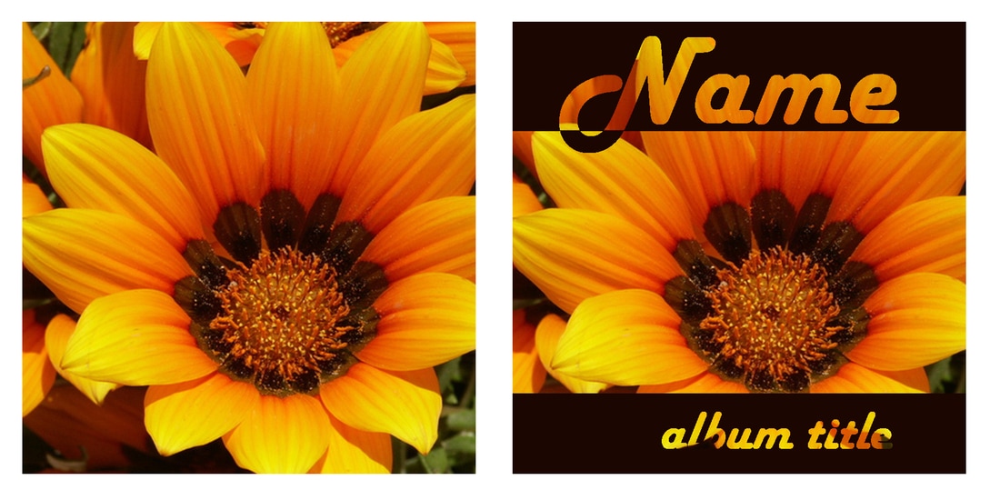 Next, we're going to apply a little bigger twist to our formula. This time, let's use a color for the bars that are specific to our image. I've sampled the color of his shirt sleeves and then lightened it. Instead of having the bars touch the top and bottom, let's bring it away from those edges a bit and let the photo continue. Let's leave the top bar thick, but make the bottom bar skinnier. And for the final twist, we'll put the top bar behind him. That effect is achieved simply by masking or erasing the part of the bar that covers up his head. You can see this gives the image a lot more depth. Again, the mood of the photo is totally different and the color schemes give it a much different feel, but the formula really hasn't changed.  This time instead of adding a bar at the top and one at the bottom, we're doing one main bar. The same bar has text reversed out for both the name and the title. We've repeated the color bar in a few skinny bands underneath it to give a cool echo effect. You'll notice we also did some tweaking on our starting image. We adjusted the saturation, hue and lightness in photoshop. We also added a back glow to the color bars. So while we still have the text reversed out showing the photo behind it, because of the back glow, it reads bright and almost electric. 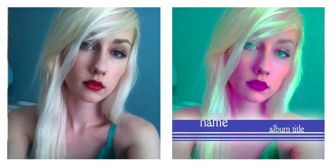 Look at what inspires you and break down the elements. Apply those to your designs and then tweak the formulas. Don't be afraid and keep an open mind. You might just be surprised at where your design instincts take you.
0 Comments
Leave a Reply. |

AuthorI'm Donna Palmer and I've been helping clients manage their optical disc projects and meeting their deadlines for some time now. In fact, CD-Lab has been in the optical disc business for 17 years. A graphic designer by trade, I know all the tricks and shortcuts and can demistify the design process. I love expanding the knowledge of my clients and learn from every project we do. This is a place to share some of that insight with you. Please join me. Archives
June 2017
Categories |

 RSS Feed
Optical Disc Products and Services since 1998
|
Contact Info:
CD-Lab
18631 N. 19th Ave Suite 158-118 Phoenix, az 85027 (mail Only) Please call for appointment Local telephone: 623 334 9277 email: [email protected] Hours: 9:00 - 5:00 Monday thru Friday |
|