|
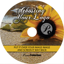
Here are 3 simple options for incorporating your logo into your disc design.  The first is really basic and appropriate for the simplest monoprint disc face. You simply look at the circle of the disc face as a clock face and place your logo in either the 12, 3, 6 or 9 o'clock locations. It keeps the look uncluttered and your logo easy to read.  The next option I refer to as ghosting. This can be done over a solid background color, but I like to do it over a photo. In this example, I centered the logo over the center of the flower. I just changed the color of the logo to all white and screened it back from 100% to 48% opacity so it was see through. This is a more subtle approach, but can look really sophisticated.  The third option, and an easy go to solution, is to interrupt a background image with a bar of color. I let the color go all the way across the disc face. In this case, I added a bump or partial circle so the whole logo would fit nicely. I also sampled a color from the background image for the color of the bar - see the pink light from the building on the far left? That helps tie the visual elements together. There are so many variations you can do with your art. These were just a few to start you thinking about some options for your disc design. I'll be sharing a lot more tips on disc design, so be sure to stay tuned!
0 Comments
Leave a Reply. |
AuthorI'm Donna Palmer and I've been helping clients manage their optical disc projects and meeting their deadlines for some time now. In fact, CD-Lab has been in the optical disc business for 17 years. A graphic designer by trade, I know all the tricks and shortcuts and can demistify the design process. I love expanding the knowledge of my clients and learn from every project we do. This is a place to share some of that insight with you. Please join me. Archives
June 2017
Categories |
Optical Disc Products and Services since 1998
|
Contact Info:
CD-Lab
18631 N. 19th Ave Suite 158-118 Phoenix, az 85027 (mail Only) Please call for appointment Local telephone: 623 334 9277 email: [email protected] Hours: 9:00 - 5:00 Monday thru Friday |


 RSS Feed
