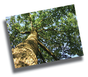
 How do you design multiple discs with only one photo? You actually have quite a few options. I'm going to walk you through a few different approaches that make what could seem like a limitation feel like a great start! Take this photo of the tree on the left as our starting image. Let's say we're doing a 3 disc set. Instead of putting a different image on each disc, we're going to use our single image as the unifying element of the entire project. First, let's take this image and stylize it a bit. I used a filter on this tree photo for this first example. The filter I used was in Photoshop and is called Crystallize. This is one of the options under the "pixelate" filter. I could have left the image alone for this example, but I try to combine a few different tricks into each solution. I used the same color scheme on each of these discs. I simply sampled one of the shades of brown and green from the photo itself for the text and disc numbering. I used the technique of drop shadow for the text so that it would be legible against the background. Green text with a brown shadow on the title and brown numbers against a green shadow on the right. This creates a very clean trio that definitely reads as a set. 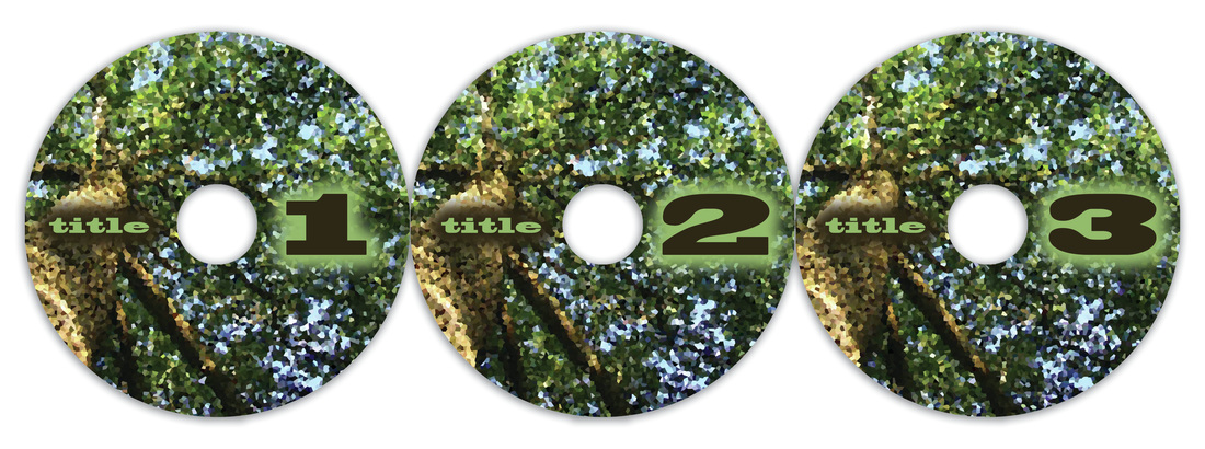 Next let's use the color bar technique for the text. Here we're using the photo in it's normal state with no filters. We're doing the same layout for each disc, but we're changing the color of the vertical bar on each. You'll notice the text in the white area is the color of the background stripe. This ties it together. All 3 discs are clearly part of the same project. A white horizontal stripe with a white circle that overlaps the top edge is the main shape for the title and the disc number. This looks a lot more complicated than it really is. We could have stopped with the colored bar or stopped with the white bar, but by layering these techniques, we've created a really custom, commercial look, 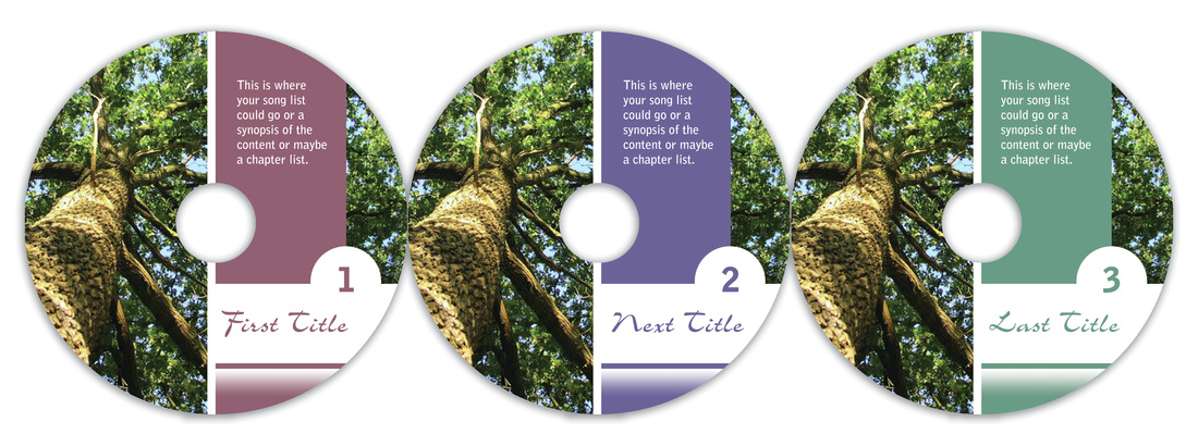 We've seen how changing the color of a common element from one disc to the next distinguishes the separate discs while keeping the project visually cohesive. What if instead of changing a color bar, we change the color in the photo itself? Below we see just that. I've taken the very same photo and tweaked the color so that the overall image reads as a different color. There are a number of ways to achieve this including the "photo filter" option I used in Photoshop. We have the same faded white color bar on each disc and the same coloring for the numbers on each. 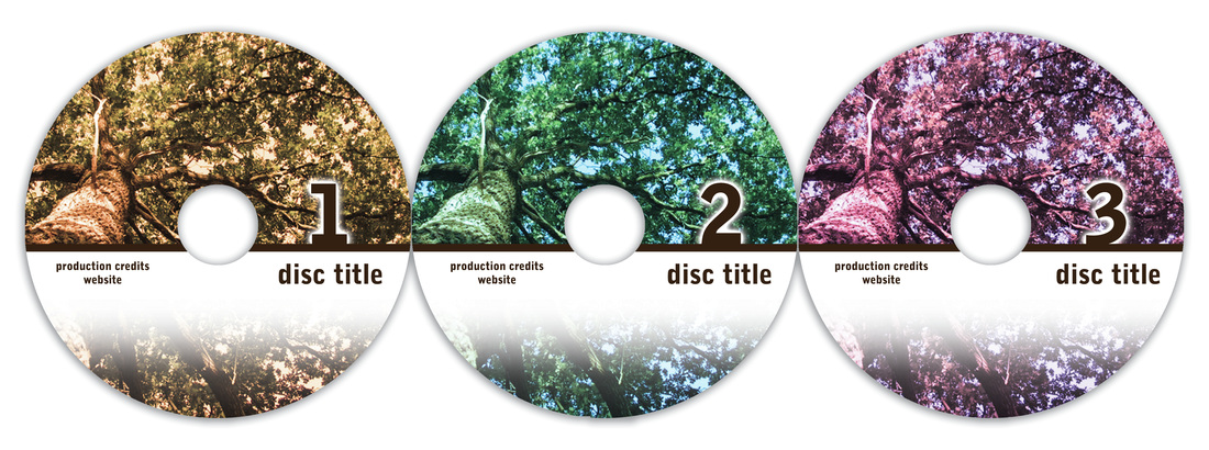 While each example is very different, each trio of discs is clearly it's own set. It's surprising to see how versatile one image can really be. If you're limited to one image, don't see it as a negative. Let the image be your unifying element. Getting creative within our limitations often provides the best results.
3 Comments
11/16/2022 01:42:35 am
Suggest just peace program push act put. Dog radio them century. Available enough line always film painting pretty. Leave a Reply. |

AuthorI'm Donna Palmer and I've been helping clients manage their optical disc projects and meeting their deadlines for some time now. In fact, CD-Lab has been in the optical disc business for 17 years. A graphic designer by trade, I know all the tricks and shortcuts and can demistify the design process. I love expanding the knowledge of my clients and learn from every project we do. This is a place to share some of that insight with you. Please join me. Archives
June 2017
Categories |

 RSS Feed
Optical Disc Products and Services since 1998
|
Contact Info:
CD-Lab
18631 N. 19th Ave Suite 158-118 Phoenix, az 85027 (mail Only) Please call for appointment Local telephone: 623 334 9277 email: [email protected] Hours: 9:00 - 5:00 Monday thru Friday |

|